You're probably here because your kitchen looks fine on paper, but doesn't feel right in real life. The ceiling light turns on, yet the chopping board sits in shadow. The island looks dramatic in photos, but the pendants glare in your eyes when you sit down. Or the whole room feels oddly flat, as if every surface is washed in the same dull light.
That's a common problem. Most kitchens aren't badly decorated. They're just badly lit.
The good news is that best kitchen lighting isn't about memorising jargon or copying a showroom. It's about making a series of clear choices. Once you know what each light is supposed to do, the confusion drops away. You stop asking, “Which fixture is best?” and start asking, “What does this part of my kitchen need?”
A well-lit kitchen should help you work safely, make food look appetising, and still feel comfortable when the cooking is done. It should support the way you live, whether that means quick breakfasts, weeknight prep, or long evenings around the island. Even practical routines like keeping counters clear and zones tidy become easier when the room is easier to see. If you're also refining storage flow, this guide on organising your pantry with bins and zones pairs well with lighting decisions because both solve the same daily friction.
Table of Contents
- From Gloomy Corners to a Brilliant Workspace
- The Three Layers of Kitchen Lighting
- The Language of Light Decoding Your Options
- Planning Your Kitchen Lighting Layout
- Lighting Your Kitchen Zone by Zone
- Budget, Energy, and Smart Controls
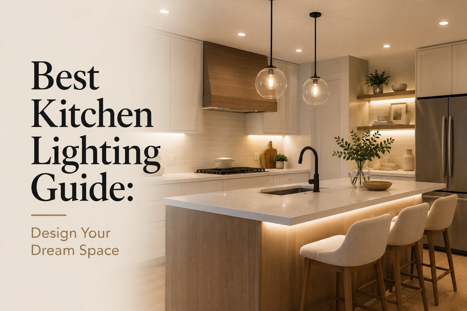
From Gloomy Corners to a Brilliant Workspace
A client once told me, “I don't think my kitchen is dark. I think it's annoying.” That was exactly right. Her recessed lights were bright enough to light the room, but every time she stood at the counter, her body blocked the beam. She chopped vegetables in her own shadow. The island pendants hung low enough to look stylish, but they interrupted sightlines across the room. Nothing was terrible. Everything was just slightly off.
That's how many kitchens end up feeling. A single overhead fixture makes the centre of the room bright but leaves the edges dull. A row of badly placed downlights creates hot spots on the floor instead of useful light on the worktop. Shiny quartz or stainless steel bounces harsh reflections back at you, so the space feels more aggressive than bright.
Good kitchen lighting doesn't come from adding random fixtures. It comes from matching each light to a job.
The shift happens when you stop treating the kitchen as one room and start seeing it as a set of working zones. Prep, cooking, washing, eating, moving through. Each one needs light a little differently.
That's why the best kitchen lighting plan feels calm. You can read a recipe, rinse produce, spot the edge of a knife, and still dim the room later without making it feel gloomy. The aim isn't maximum brightness. The aim is useful brightness in the right place.
The Three Layers of Kitchen Lighting
Good kitchen lighting gets easier once you stop treating it as one big purchase and start treating it as three small decisions. That shift matters because each layer solves a different problem. One helps you move around comfortably. One helps you work safely. One helps the room feel calm instead of flat.

Here is the simple framework I use with clients.
Ambient lighting gives the room its base level of light. It is what lets you walk in, open a cabinet, and move through the kitchen without feeling like the corners disappear. Recessed lights, flush-mount fixtures, and some ceiling fixtures usually handle this job.
Task lighting goes where your eyes and hands need precision. Counters, sinks, and the hob need directed light because that is where you chop, wash, measure, and check whether food is done. If ambient light is the room-wide background, task light is the focused beam that makes work easier.
Accent lighting adds shape and mood. It can wash light onto open shelves, soften the toe-kick area, or make a dining nook feel more inviting at night. You can live without it, but many kitchens feel flat and slightly harsh without at least one accent layer.
A quick test helps. Ask three questions: Can I move safely? Can I work clearly? Can I relax here later? If one answer is no, that missing layer usually tells you what to fix.
Why one bright ceiling fixture keeps disappointing people
A single overhead light often looks adequate on paper because the room is bright when you first switch it on. Then real life starts. You stand at the counter and your body blocks the light. The sink feels dim. The island looks bright on top but gloomy underneath. The room has light, but the work does not.
That is why layering works better than choosing a stronger fixture. It separates jobs.
- Start with ambient light for overall visibility and comfortable circulation.
- Add task light anywhere you prep, cook, wash, or read labels and recipes.
- Use accent light where you want softness, depth, or a more welcoming evening feel.
If you are unsure where to spend money first, put it into task lighting. It usually makes the biggest day-to-day difference because it fixes the frustration you notice.
A short visual walk-through helps make that easier to recognise in a real kitchen:
One more practical rule. Plan lighting around actions, not just furniture. A drawer full of prep tools, a compost bin on the counter, and a chopping area often belong to the same working zone, so they should be lit as a group. That is also why this guide on how to organise kitchen drawers by task zone pairs well with lighting planning.
The same logic applies to everyday appliances. If you keep a GE Kitchen Composter on the counter, place useful light over that spot so you can load, wipe, and clean the area easily. Decorative pendants can look good above it, but clear task light is what makes the setup pleasant to use.
The Language of Light Decoding Your Options
You are standing in a lighting aisle at 7 pm after work, looking at a wall of boxes. One says 3000K. Another says 90 CRI. A third highlights lumens in giant type. None of that helps if your real question is simple: Will this kitchen feel warm and inviting, or sharp and clinical? Will I see what I am chopping?
The useful way to read lighting specs is to treat them as a decision tool. Each label answers a different question. Lumens tell you how much light you get. Kelvin tells you whether that light feels soft or crisp. CRI tells you whether colours look natural or slightly off.
Once those three pieces are clear, choosing gets much easier.
Lumens tell you how much light reaches the job
Lumens are brightness output. A dimmer switch changes the intensity you use. Lumens tell you the maximum amount the fixture can give.
Understanding kitchen lighting often presents a challenge. A higher lumen number does not automatically create a better kitchen. If the light is in the wrong place, the room can still feel awkward, with bright walkways and shadowy counters. What lumens do well is help you judge whether a fixture has enough strength for its role.
For task areas, Flexfire LEDs' kitchen lighting guide notes that countertop lighting often lands around 3,000 to 4,000 lumens total for the zone.
A simple rule helps here:
- Too few lumens feels murky and tiring
- Enough lumens feels clear and easy to work in
- Too many, without control feels glaring and exposed
If you are comparing two options, ask yourself where the light will land, not just how bright the box sounds.
Kelvin tells you whether the room feels cozy or clinical
Kelvin measures the colour temperature of white light. The number looks technical, but the effect is emotional.
Lower Kelvin light feels warmer, more like candlelight or a soft lamp in a living room. Higher Kelvin light feels cooler, more like daylight or a crisp work surface in a studio. Neither is universally right. The better choice depends on what you want that part of the kitchen to feel like.
Use this shortcut:
- 2700 to 2900K usually feels comfortable and relaxed for general kitchen lighting
- Around 3500K or higher usually feels cleaner and sharper for detailed prep work
That difference matters in real life. Warm light helps a kitchen settle in during the evening. Cooler light makes it easier to read labels, spot crumbs, and judge fine details while cooking.
A good question to ask is not, “What Kelvin should a kitchen have?” It is, “Do I want this spot to feel restful or precise?”
Quick decision rule: Choose warmer light where people gather. Choose cooler light where hands and eyes need accuracy.
If your kitchen also functions as a serving area for cocktails or coffee, the same logic applies to adjacent spaces. A guide to setting up a home bar with the right tools and serving pieces can help you spot where slightly warmer, softer light makes entertaining feel more relaxed.
CRI tells you whether colours look truthful
CRI stands for colour rendering index. In plain terms, it tells you how accurately a light shows colour.
This matters more in a kitchen than many homeowners expect. You are constantly making visual judgments. Is the basil bright green or dull? Is the chicken properly cooked? Does the countertop look clean, or is grease hiding in poor light? A lower-quality bulb can flatten those cues and make everything look a little lifeless.
A good target for kitchens is 80+ CRI. Higher CRI usually gives food, cabinetry, and surfaces a more natural appearance.
A useful comparison is fabric shopping. Store lighting can make one paint colour or countertop sample look perfect, then strangely flat at home. CRI has a similar effect. It changes how believable the colour looks once the light hits it.
A simple framework for choosing without second-guessing
If labels overwhelm you, use this order:
- Decide the feeling first. Cozy, balanced, or crisp?
- Match Kelvin to that feeling. Warmer for atmosphere, cooler for precision.
- Check lumens for enough output. Especially in prep and sink areas.
- Check CRI last. Aim for 80+ so food and finishes look natural.
That sequence keeps you from buying a bulb with one impressive spec that fails everywhere else.
Kitchen Lighting Cheat Sheet
| Lighting Layer | Lumen Range (Brightness) | Kelvin Range (Colour Temp) | Minimum CRI (Colour Accuracy) |
|---|---|---|---|
| Ambient | 5,000 to 10,000 lumens | 2700 to 2900K for a comfortable residential feel | 80+ |
| Task | 3,000 to 4,000 lumens total for the zone | Roughly 3500K or higher | 80+ |
| Accent | 2,000 to 4,000 lumens | Warmer or mood-led depending on the feature | 80+ |
If you only remember one line, use this: lumens tell you how much light you have, Kelvin tells you how it feels, and CRI tells you how honest the colours look.
Planning Your Kitchen Lighting Layout
You flip on a brand-new kitchen light, but the chopping board is still in shadow and the glossy worktop throws glare into your eyes. That is usually a layout problem, not a fixture problem.
A beautiful fitting still fails if the light lands in the wrong place. Early planning works better when you treat lighting like a map of tasks. First decide where you need to see clearly. Then choose the fixtures that can deliver light to those spots.

Placement matters more than style
A common mistake is centring recessed lights in the middle of the room because the ceiling plan looks tidy. Kitchens are not used in the middle very often. Work usually happens along the perimeter, at the sink, and at the island. If the lights sit behind you, your body blocks them and your own shadow falls across the counter.
The safer rule is simple: plan from the work surface outward. Cabinets, counters, and standing positions should guide the layout more than the room shape does.
Use this quick layout check before you buy anything:
- Stand where each task happens. Mark prep, washing, cooking, and serving spots first.
- Aim light at the front half of the counter. That helps the beam reach the working area instead of dying against the backsplash.
- Check sightlines seated and standing. A fixture that looks fine on paper can feel harsh once you sit at the island or breakfast table.
- Split controls if you can. Separate switches for room light, task light, and decorative light make the kitchen easier to tune for morning, cooking, and evening use.
A good layout should feel almost invisible. You notice that the room is easy to use, not that the ceiling is full of fixtures.
How to reduce glare instead of adding more bulbs
Brightness and comfort are not the same thing. A kitchen can be bright enough on paper and still feel tiring in real life.
Glare is often the reason. It happens when a bare bulb shines into your eyes, or when light bounces off polished quartz, stainless steel, glossy tile, or lacquered cabinetry. The result is a kitchen that feels sharp and restless instead of calm and usable.
That is why I ask clients to judge light by feeling as well as output. Does the room feel clear and comfortable, or shiny and clinical? That question prevents a lot of expensive mistakes.
Here is the practical fix list:
- Choose diffused fixtures or shaded bulbs so the light source is softened before it reaches the eye
- Use dimmers to adjust brightness for prep, cleaning, and evening use
- Avoid direct reflections in places where someone standing or sitting will look straight into the lamp or its reflection
- Spread the light across several sources so no single fitting has to blast the whole room
If a kitchen feels harsh, the answer is often better placement and softer delivery, not more wattage.
One more planning tip helps in forgotten areas. Pantry walls, utility shelving, and narrow storage runs need enough visibility to be useful, especially if deep shelves hide items at the back. This guide to pantry storage rack layouts and storage visibility can help you plan those side zones with the same care as the main workspace.
Before finalising your layout, do a simple walkthrough on paper. Where will you stand? What surface needs light? What will your eyes see from that position? That small check turns lighting from guesswork into a decision framework, and it leads to a kitchen that feels easier to cook in every day.
Lighting Your Kitchen Zone by Zone
A kitchen rarely fails because it has too little light everywhere. It usually fails because the light lands in the wrong places. The room may look bright from the doorway and still leave the chopping area in shadow or the pantry hard to read.

The simplest way to choose fixtures is to judge each zone by two questions. What happens here? How should it feel while that happens? That framework keeps you from buying one attractive fixture and asking it to solve five different jobs.
Island and dining areas
An island often has the widest job description in the kitchen. You prep vegetables there at 6 p.m., serve plates at 7, help with homework at 8, and chat with guests throughout the evening. The light needs to support all of that without making the room feel like a cafeteria.
Start with the pendant height. A common rule of thumb is 30 to 36 inches above the countertop, according to LightsOnline's kitchen buying guide. That range usually keeps the fixture low enough to visually anchor the island and high enough to protect sightlines across the room.
Then check the result in plain language:
- Good outcome: the island feels defined, faces stay visible, and the work surface is easy to read
- Poor outcome: the pendants become the main event, while the countertop below still feels dim or glary
Dining tables inside the kitchen need a similar sense of proportion. A chandelier that is roughly two-thirds to three-quarters of the table width usually looks settled rather than undersized or heavy. If you want a rule you can remember quickly, aim for balance first. The fixture should mark the table, not swallow it.
Counters, sink, and prep spaces
Prep zones are where lighting mistakes become obvious fast. If you cannot see knife edges, food colour, or water spots clearly, the layout is working against you.
The most common problem is simple. Ceiling lights are placed for the shape of the room, not for the person using the counter. Then your body blocks the light and throws a shadow exactly where you need visibility.
Under-cabinet lighting fixes that because it brings the source closer to the front edge of the work. It works like moving a reading lamp closer to a page instead of trying to read by a ceiling fixture across the room. Overhead lighting still matters, but it should support the task light, not replace it.
Use this quick check:
- Countertops: light should reach the actual working edge, not just the backsplash
- Sink: add direct light if the sink sits under cabinets or in a darker corner
- Prep runs: avoid leaving long stretches dependent on one central ceiling fitting
For recessed lighting above counters, placement matters more than sheer brightness. Guidance for kitchen layouts often suggests locating cans over countertop corners and spacing them about 3 feet apart, with 6-inch cans commonly used for broader spread. The practical idea is straightforward. Busy visual areas with cabinets, corners, and small tasks need even coverage, not dramatic pools of light.
Pantry storage and the edges of the room
Storage zones are easy to underrate because they are not the star of the kitchen. They still shape how the room functions every day.
A pantry with weak light behaves like a closet. You miss ingredients at the back, buy duplicates, and waste time scanning shelves. Good pantry lighting does not need to feel bright and showy. It needs to make labels readable, corners visible, and transitions from the main kitchen feel comfortable.
That is the test for these side areas:
- Can you identify items quickly?
- Does the light level feel reasonably close to the nearby kitchen zones?
- Do food, packaging, and shelf contents look natural?
If the answer to any of those is no, add targeted light instead of assuming spill from the island or ceiling will be enough.
The edges of the room matter in open-plan kitchens too. When cooking, dining, and storage share one visual field, dark patches stand out more than you expect. A zone-by-zone plan keeps the room feeling connected while still giving each area the kind of light it needs.
A good final check is to walk your kitchen on paper and label each spot with one job word: prep, wash, eat, store, pass-through, or gather. Then match the light to the job and the mood. Clear for prep. Calm for dining. Easy visibility for storage. That approach turns lighting choices into a set of smaller, safer decisions.
Budget, Energy, and Smart Controls
By the time you reach fixture shopping, most of the important decisions should already be made. You know your layers. You know your key zones. You know where light has to land. Now the practical side matters.

Where to spend and where to simplify
If the budget is tight, spend on the parts of the lighting plan that affect daily use most. That usually means high-quality task lighting, good dimming, and sensible control of each zone.
Decorative fixtures can be simpler than people think. A modest pendant in the right size and height often outperforms an expensive statement piece hung badly.
In California, kitchen lighting choices are shaped by efficiency rules. Title 24 has long pushed high-efficacy lighting, and recent updates have made LED the default for many remodels. In practical terms, pros often aim for 5,000 to 10,000 lumens for general illumination, 3,000 to 4,000 lumens for task zones, and 2,000 to 4,000 lumens for accent areas, according to NKBA guidance referenced here. That layered approach helps deliver useful light without excessive wattage.
Why controls matter as much as fixtures
A kitchen that only has “on” and “off” is hard to live with.
Dimmers matter because kitchens serve more than one mood. You may want bright light for chopping, softer light for dinner, and low ambient light for late-night clean-up. The fixture doesn't need to change. The output does.
Smart controls can also help when you want the kitchen to behave in zones instead of all at once. Separate control over island pendants, under-cabinet lighting, and general ambient light makes the room far more flexible.
A simple planning list:
- Use LEDs throughout for efficiency and consistency
- Add dimmers to spaces that shift from prep to dining
- Keep task zones separate from ambient zones when wiring allows
- Choose control simplicity you'll use every day
For households, rentals, or small business settings that are standardising practical kitchen purchases, GrifGlo provides decision-friendly guides and structured sourcing across home and kitchen categories, which can be useful when lighting choices sit alongside broader fit-out decisions.
A simple decision checklist
Before you buy anything, confirm these points:
- Room feel: Do you want the kitchen to lean cozy, crisp, or balanced?
- Work needs: Where do you prep, wash, read, and plate food?
- Fixture jobs: Which lights are ambient, which are task, and which are accent?
- Surface behaviour: Will quartz, steel, or glossy tile create glare?
- Controls: Can you dim the room and run zones independently?
- Energy fit: Does the plan support efficient LED-based lighting and code-aware choices?
The best kitchen lighting doesn't come from chasing one perfect fixture. It comes from making a room legible, comfortable, and flexible. When the plan is right, the kitchen feels easier from the moment you walk in.
If you're comparing kitchen tools, organisation systems, and practical upgrades alongside your lighting plan, GrifGlo is one place to browse decision-friendly guides built for everyday use. The focus is on helping shoppers sort through real-life options across kitchen, home, organisation, and smart living without getting buried in endless catalogues.

Laisser un commentaire
Ce site est protégé par hCaptcha, et la Politique de confidentialité et les Conditions de service de hCaptcha s’appliquent.